Matheo Cadena


Children’s Hospital Los Angeles (CHLA)
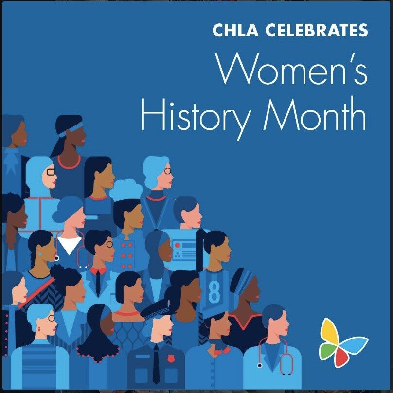
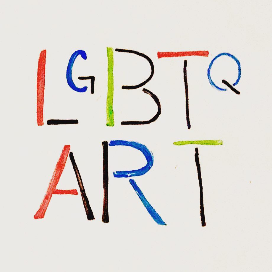
Pride Month Campaign
Problem
The CHLA was at risk of loosing $1M in grant funding.
Existing marketing and social media content wasn’t engaging new audiences, specifically LGBTQ+ demographics. Each post was reaching 500-1,289 people. However, this new service for Queer young adults offered by the DAYAM was essentially going unnoticed, low reach and engagement lead to low conversion.
Brief
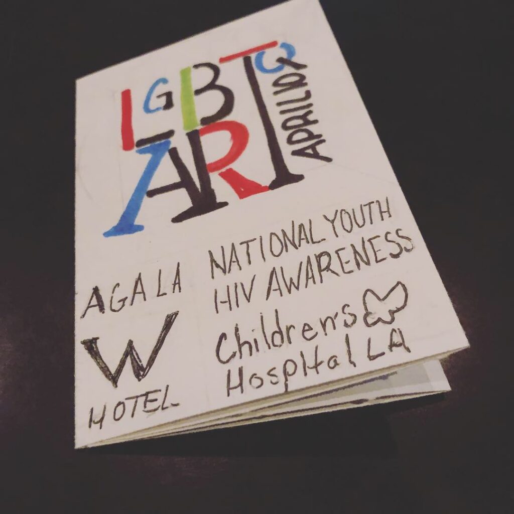
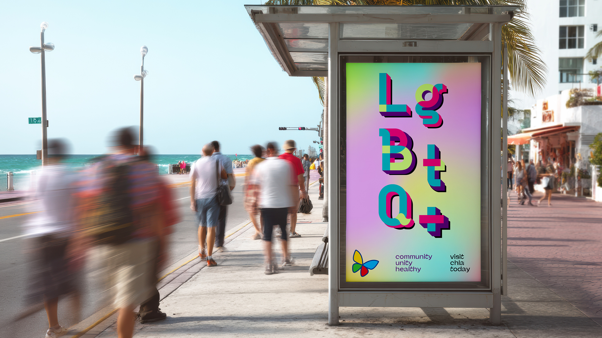
Design a social media campaign for pride month that engages new audiences raising awareness for the healthcare services provided by the Division of Young Adolescent Medicine (DAYAM). Avoid the all too common rainbow washing.
Solution
My design strategy leveraged edu-tainment content with high-frequency posting for an engaging Pride campaign.
I hand sketched concepts for a pride month campaign series that was designed to hack the algorithm. With high-frequency content that educated the audience on each letter in the LGBTQ+ acronym. Engaging allies and Queer folx throughout the life cycle.
Process
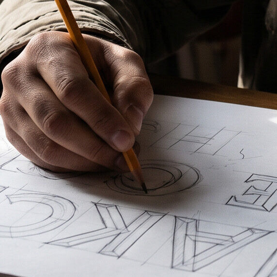
Sketching
I always begin with paper and pencil before going digital. Concepting my ideas by hand helps me think through the problem and come up with new ideas that don’t come from a computer.
Inspiration
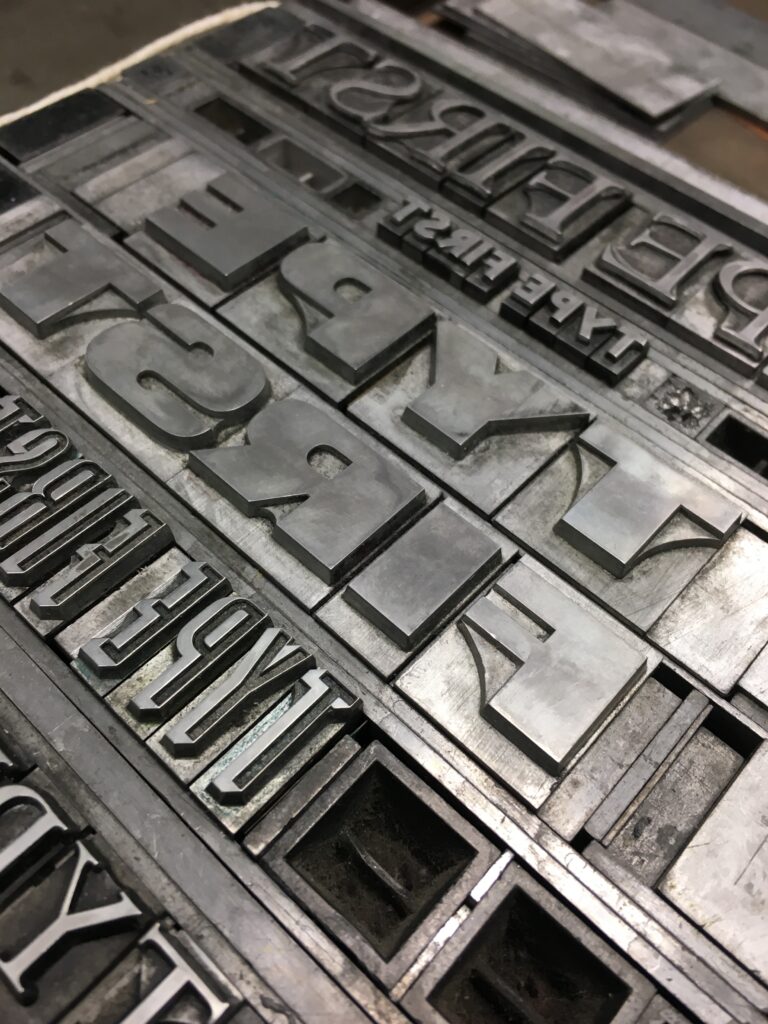
Working with Letterpress
I had the honor of taking a workshop at the HMCT Archetype Press at ArtCenter.
I Fell in Love with Movable Type
Working with movable type inspired me to recreate my own version of movable type.
Reshaping the Way I Approach Design for Good
The letterpress design process completely changed the way I typeset.
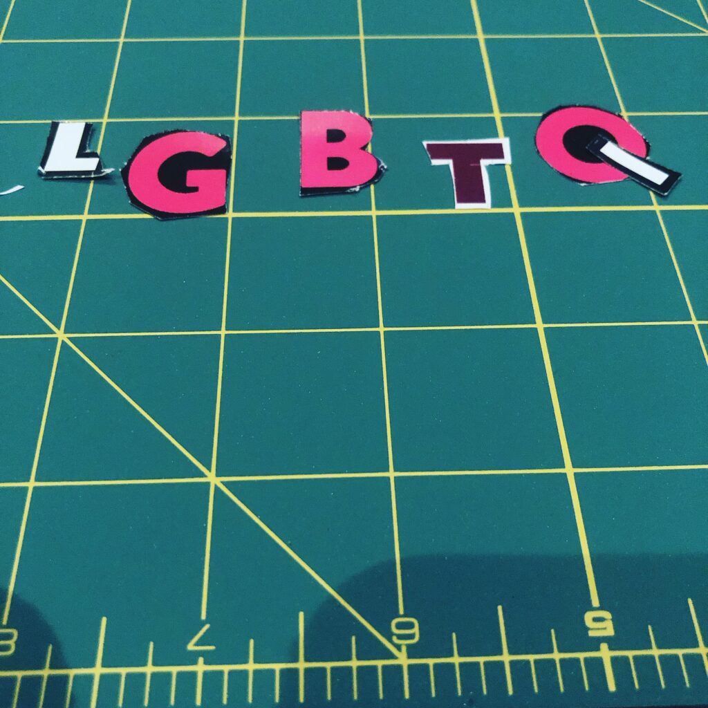
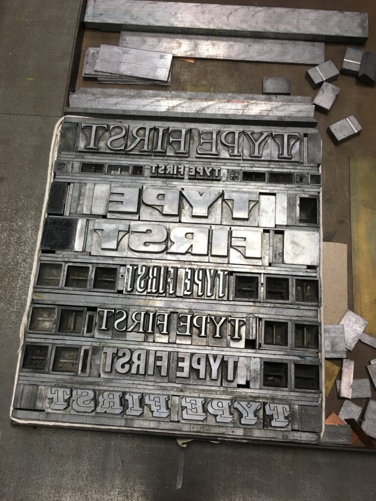
Magazine Cutouts
In effort to create my own movable type, I cut out letters from magazines, mail ads, and brochures.
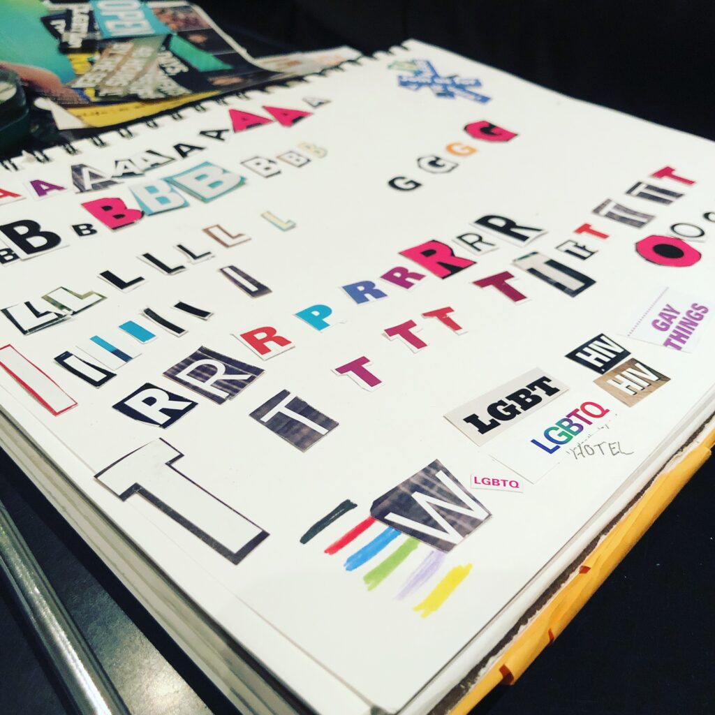
I Created My Own Analog Movable Type Library
This forced creative constraints, causing me to rethink the way I was arranging the primary letterforms: LGBTQ+.
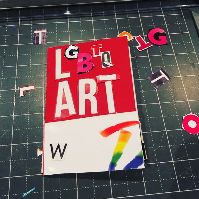
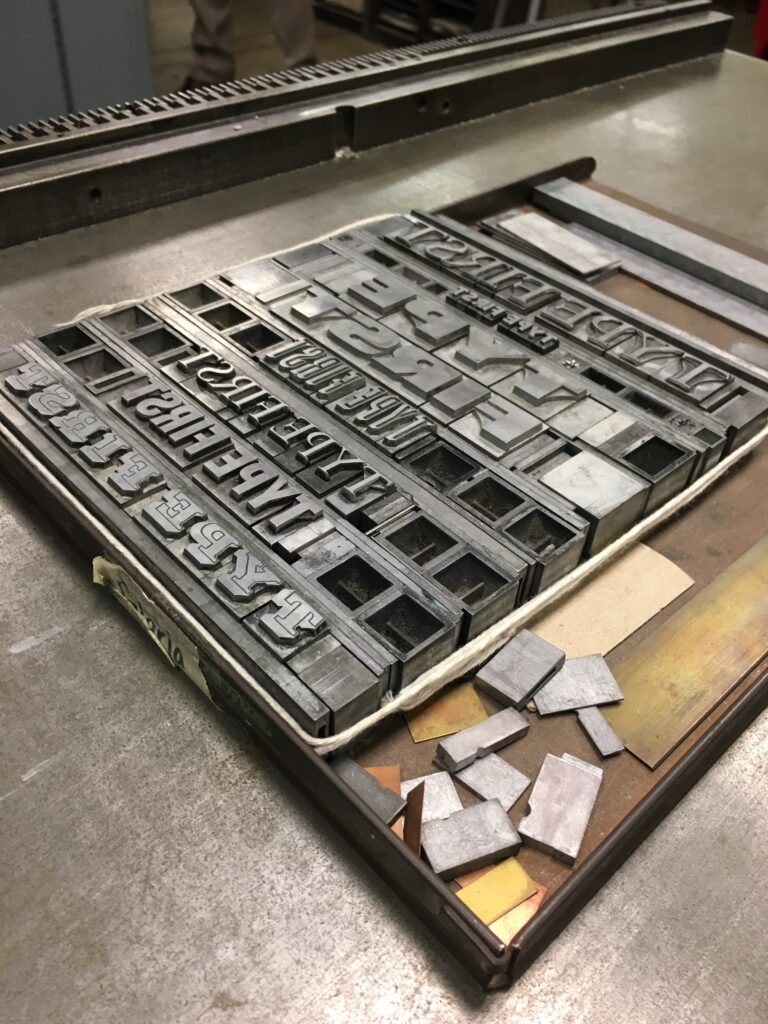
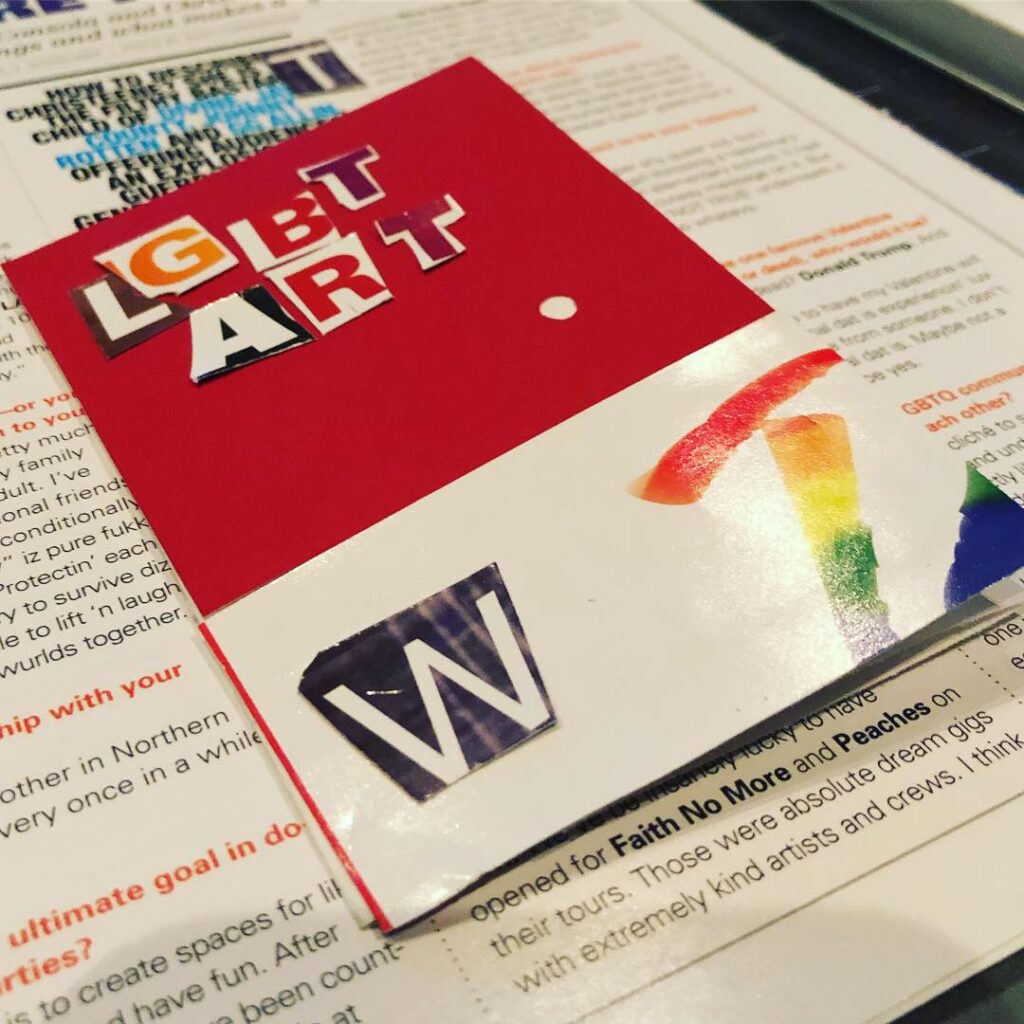
Typesetting the Pieces Together by Hand
Shifted the creative neural pathways unlocking a new creative methodology to approach solving the same design challenge.
Experimental Typography
I allowed myself to play and have fun with forgoing perfectionism, leading me to discover new patterns within the letterforms.
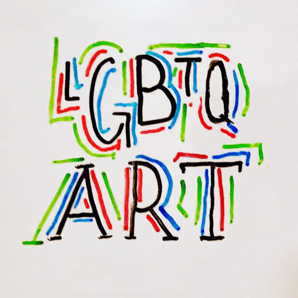
Exploring Hand Lettering
After creating my own version of movable type, I tried hand lettering.
Dancing Letterforms Across Printed Matter
I experimented with bounce lettering allowing the baseline to gleefully shift .
Queering the Letterforms
The bouncing baseline, a metaphor for the diversity within our Queer community.
Exploring Marker on White Board Making by Hand
Continuing the trend of typesetting by hand, I was referencing Keith Haring’s work to try and capture the spirit of LGBTQ+ art.
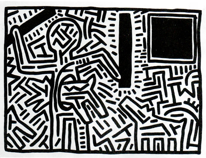
Keith Haring, Untitled Work
Keith Haring was an outspoken artist and activist during the 80s aids epidemic bringing light to the issue through painting massive murals across the cityscape of NY.
Hand Lettering Style: Inspired by Queer Activist, Keith Haring
I explored referencing the line work of Keith Haring to callback to the aids epidemic, which made way for modern Pride celebrations.
Discovery
UX Design
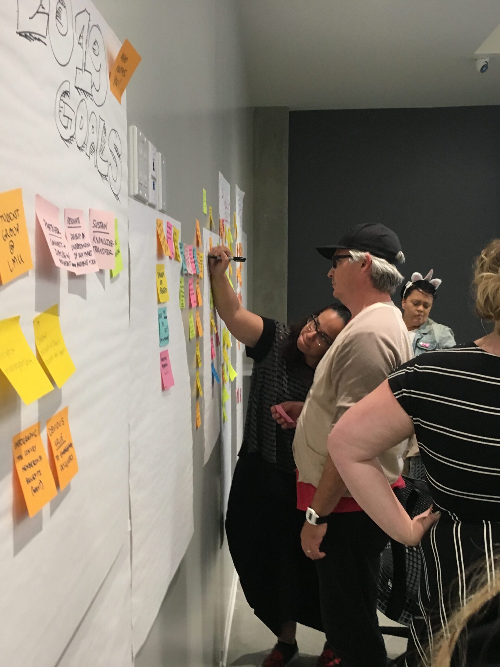
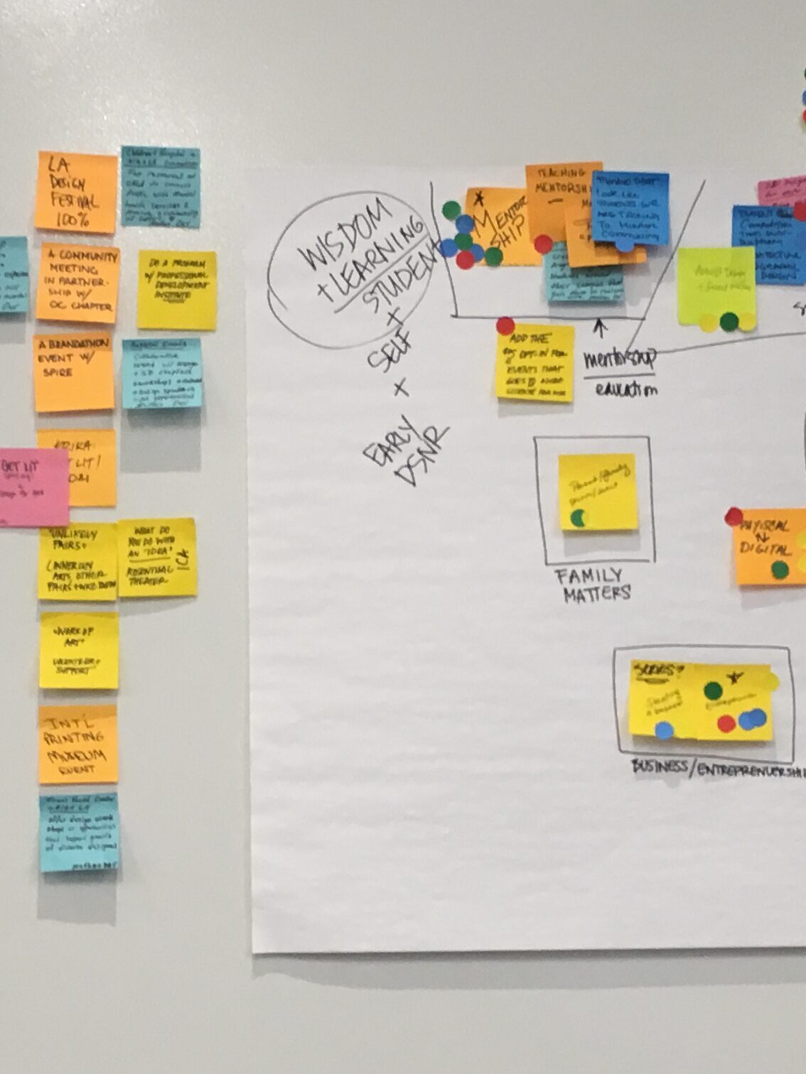
User Journey Mapping
Gathered insights across departments to identify pain paints and gains.
Design Thinking
Leveraging the IBM Framework
To clearly cluster core issues for the target demographic and plot potentials gains.
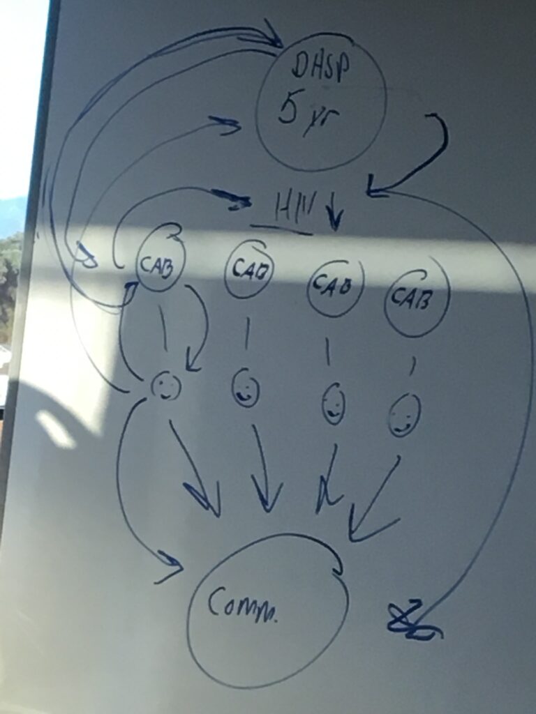
Design Strategy
Distilling Insights Into an Actionable Plan
I sketched an actionable project roadmap from cross department collaboration sessions.
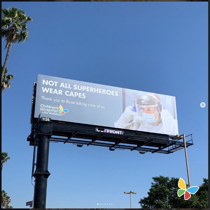
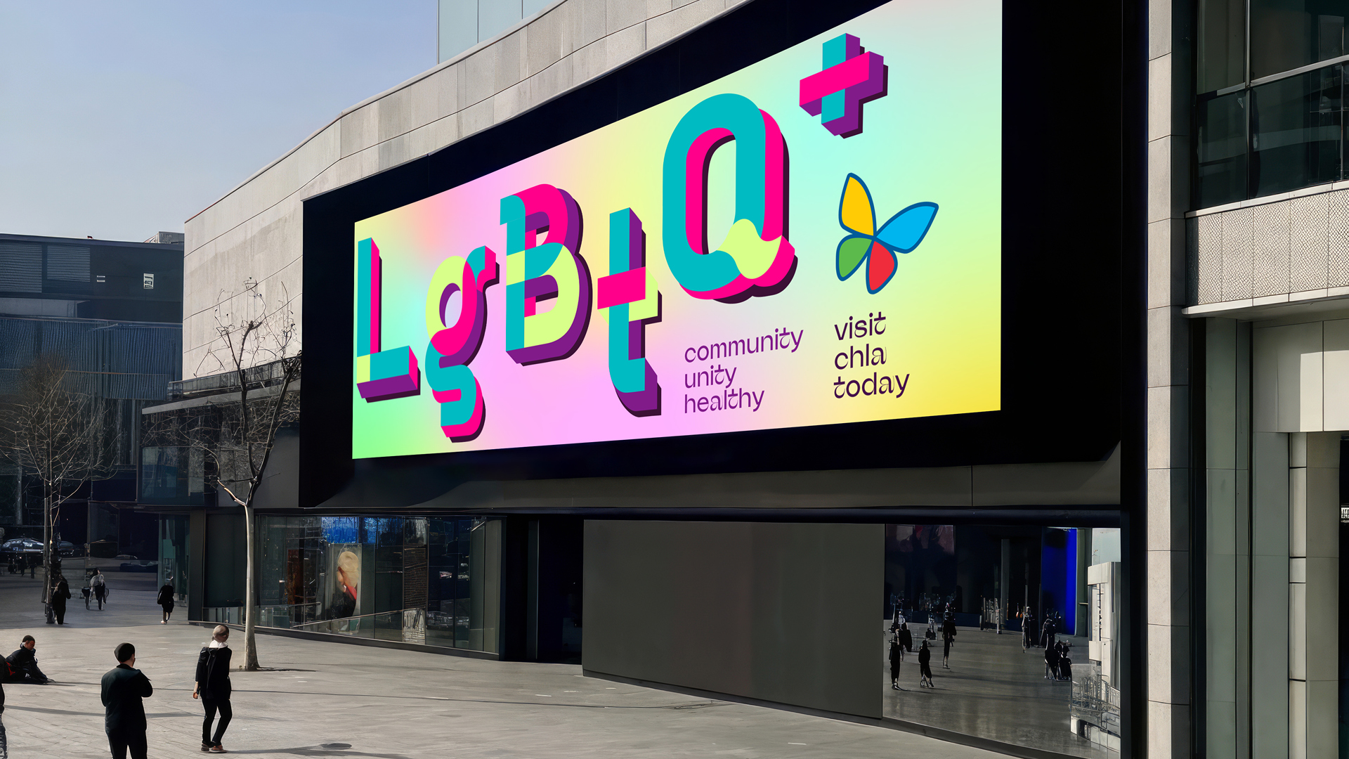
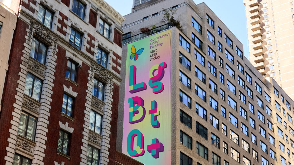
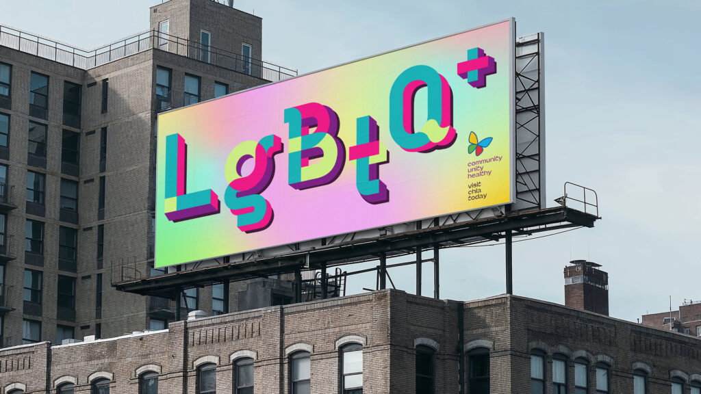
Out of Home (OOH) Campaign
During the discovery process, we had the big idea. Engage our audience through 360 marketing campaigns. Reaching across social media and the city of LA by leveraging OOH campaigns with a consistent brand identity across every touch point.

Adobe Illustrator
My primary tool for recreating high-quality vector versions of my analog letterforms I had explored with pencil, paper, markers, white boards, and magazine cutouts was Adobe Illustrator.
Resizing
Social media time is split between posts, stories, and reels. With that in mind, I redesigned the campaign to engage people at each of these social touch points.


Banners
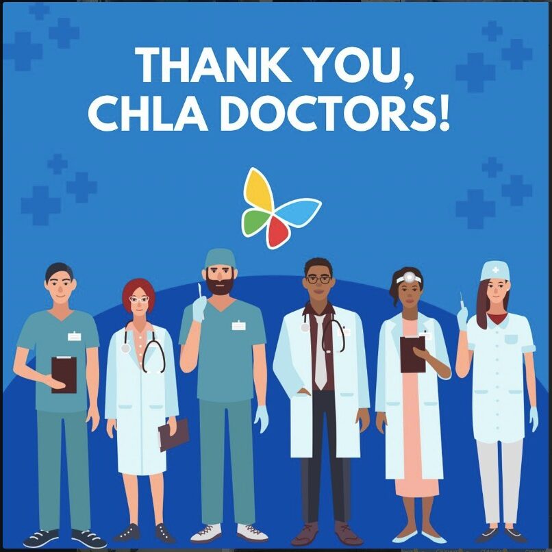
Designed the marketing kit so the CHLA team was able to also distribute the same social media campaign identity across their newsletter, website, press release, Medium, using the hero art.


Results
Co-lead the pitch team and presented our results landing $1M in grant funding from LA.
Increased social media reach engaging and converting new leads. Previous campaigns reached an average of 1,210 people, whereas, the new campaign reached over 12,325 people. Additionally, new walk-in clients increased from 9 per month to 33 per month.
Maserati
Marketing Campaign Design in Figma
Brief
Design campaign for the Maserati annual Winter Sales Event.
Problem
Design mobile & web assets in Figma under high pressure marketing deadlines, revising with stakeholder feedback.
The Maserati company switched all their designs from Adobe to Figma. Allowing them to reduce friction and increase their dev team build times. However, the current design team lacked the expertise in Figma to deliver. They needed to onboard a designer who could work in Figma and deliver the design assets fast. I delivered. Working at the speed of light.
Solution


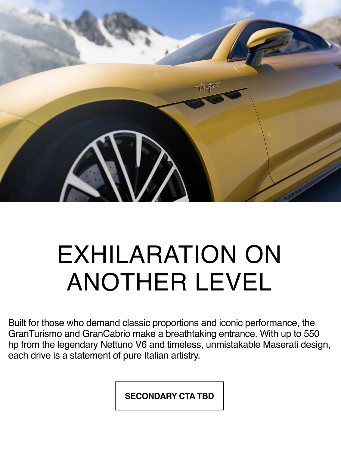
Results
The dev team was able to reduce campaign deployment time from 8 hours of coding and testing to 3.5 hours.
Delivered design assets ahead of schedule. Gaining approval of stakeholders, and working in revisions. Worked collaboratively and iteratively throughout each sprint cycle to deliver high fidelity mocks in Figma.
Pokémon
Type + Pkm
Brief
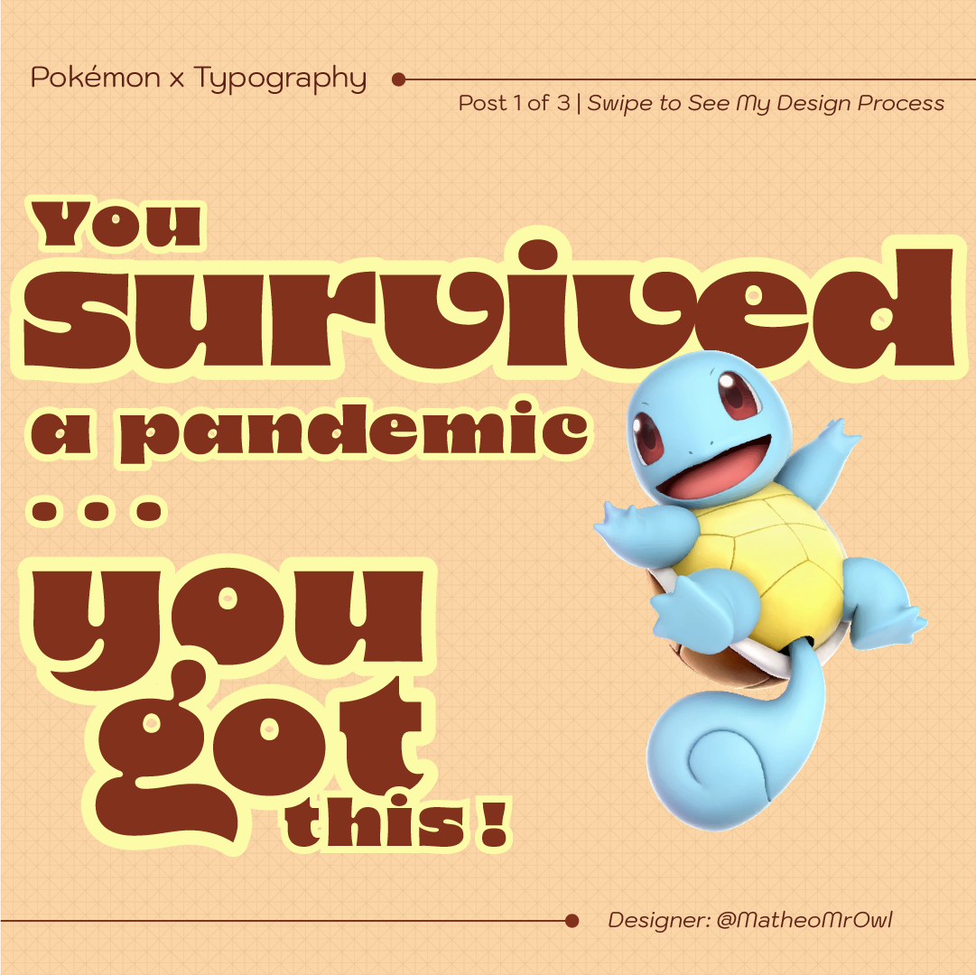
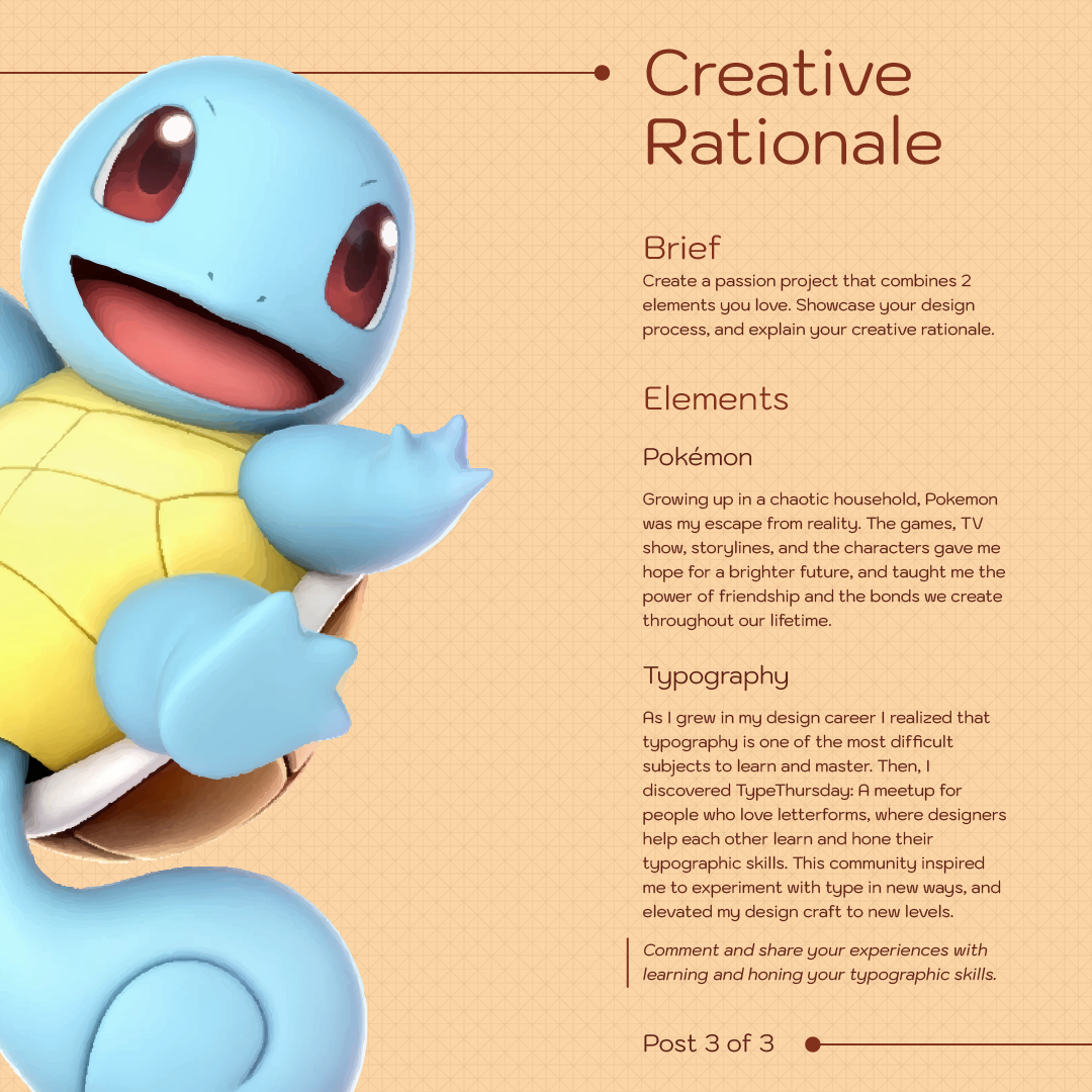
Using Adobe Illustrator create a design that incorporates: Typography, positive affirmation, and Pokémon.
Problem
Most Pokemon art and design campaigns do not use typography well.
This project centers the two in harmony.
Solution
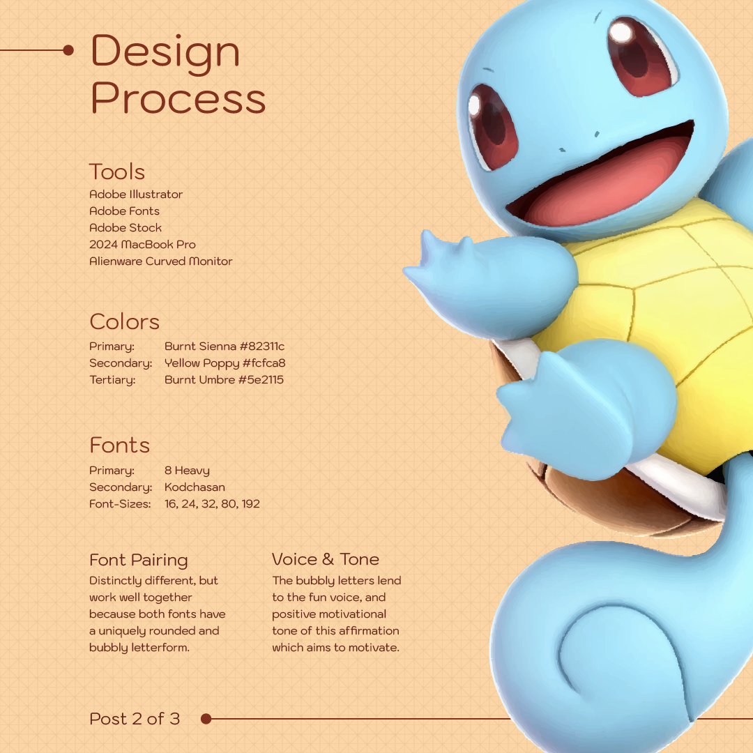
Swiss grid system, 8 base unit, every typographic element is proportional to the artwork and joyful rounded and bubbly font to match the mood of the game.
The font is rounded with curvatures and bubbly joy much like the Pokémon characters. This font pairs perfectly with the joyous energy and dynamic pose of Squirtle.
Results
Increased engagement with gamer and typography communities.
By crossing design, typography, and gaming culture, I was able to successfully engage audience from different cultures.
Let’s Work Together & …

Design Your Brand
You need a brand that meets your vision, while engaging your target audience. As an award-winning designer, I’ll craft a brand identity that embodies your vision and engages your customers.
Expand Your Marketing
You have an existing brand, but it’s not performing. You need to grow your brand awareness and engage new customers. I’ll craft a marketing strategy that helps you reach new customers, and convert to ROI.
Navigate Your Career
You’re stuck in your career, applying, but not hearing back. I’ve mentored people to navigate rounds of interviews with LA26 Olympics. I’ll guide you with actionable next steps and career clarity.
Fly Me An Email
If you’re looking for a designer who cuts through the noise, and uplifts your brand’s marketing into high converting campaigns, that increase your ROI, then let’s chat.